Overlaid colour: screenprint
This next project is going to be a playful use of colour. Thinking of how I create stencils in a new way, I'm going to explore organic shapes. These are Fimo shapes rolled flat and baked. Left over from another project- what appealed to me was their irregularity...
Above: Fimo shapes used to make stencil
Below: first test sheet
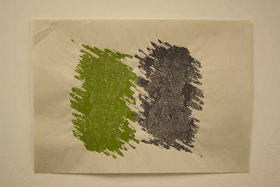
Green and purple grurple: screenprint
When red met yellow
Preparing for the degree show I began screen-printing 20cm squares of colour, working from yellow to red, through orange. The colours were mixed entirely by hand. The prints on the wall were the most successful in terms of printmaking- less smudges and blemishes and of good colour gradation.
As with printmaking of all kinds, there were just as many that didn't make the grade...
To break the monotony, I occasionally deviated to a new colour...
making work at home: the inevitable...
Pattern / screenprint 2009
Screen-print; Orchid
Sreen-print; leaf

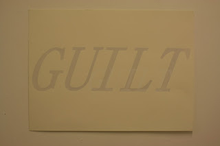
Signing up for GUILT and shame: screenprint

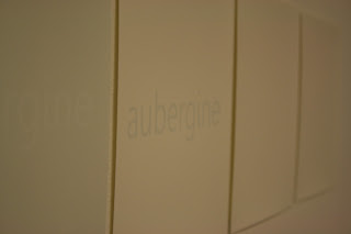
Aubergine: screenprint
Gaggle of splats: screenprint
Screen-print showing apparent texture in flat print. Original positive created by photocopying paint...
stepped screen-print working from white to black in over 20 gradual overlapping prints. Printed on domestic lining paper
Detail from the complete series: screenprint 2009
WHITE
RED SHADE BLUE
YELLOW SHADE RED
RED SHADE YELLOW
BLUE SHADE GREEN
RED SHADE BLUE
RED SHADE BLUE
Degree show, FdA Byam Shaw. -some alternative installation shots showing the series of prints...


The complete series is an exploration of colour. Inspired the the work of Josef Albers and Johannes Ittens. The prints were created on somerset velvet A1 printmaking paper and hand cut cartridge paper (approximately A3). Each of the colours were hand mixed using high quality water-based printing ink, including the grey. By mixing the colours by hand I was able to create the exact hues to complement the series.


No comments:
Post a Comment